M+G loves Jonathan Tuckey
Rather than repair or restore old buildings, architect Jonathan Tuckey breathes new life into them. He designed two dramatic - and completely individual - spaces for MALIN+GOETZ’s first ever London stores (on Upper Street in Islington and Monmouth Street in Covent Garden). We spoke to Tuckey about the challenges involved in working on two different projects, his organic design process and, most importantly, the beautiful ambiguity of blending old and new.
Your practice specialises in the adaptive reuse old buildings, often in radical and unexpected ways. What kinds of opportunities and challenges does this method present as opposed to designing ‘from scratch’?
It’s often quite a complicated journey for the contractor or builder because they end up finding things that they didn’t expect. So, in a sense, you have to have a design that is able to evolve as things get uncovered along the way.
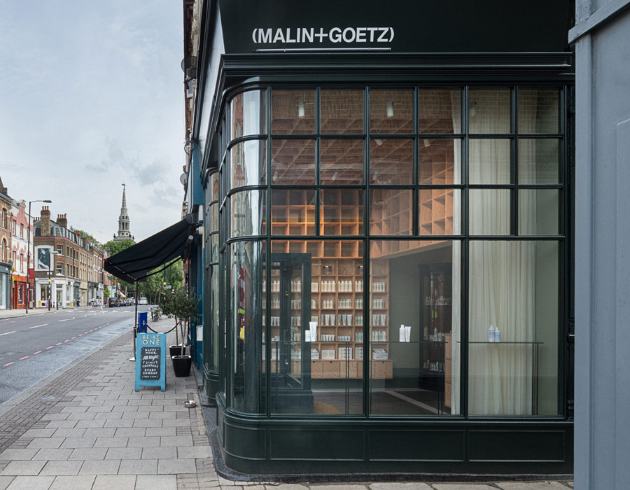
For example, the MALIN+GOETZ shop on Upper street was, at first glance, a cute little [Victorian] corner store. But when we took a little hole in the plasterboard ceiling on the ground floor, I could peer through and, with a torchlight, found out that there was another metre of space. We ended up getting a ladder, going up there, putting a hole through that celling and found that there was another half a meter above that! So, we ended up with a good meter and a half of hidden space.
So did you have to go back to the drawing board?
When the height revealed itself to us it presented so many other opportunities. It turned out to be a much more dramatic space, with proportions that were more exciting. We could imagine all the beautiful bottles stacked over two stories which, on a relatively small footprint, is rather theatrical.
What we did need to do was remake the storefront because it had been covering up this extra metre and a half.
So the process of uncovering revealed a way of designing?
Yes, and if we chose to present that height in an uncritical way it would have become sort of meaningless. We had an opportunity to divide, align and proportion the space in a new way.
And the shelving grid does that perfectly…
The units step out at a lower level so you can interact with them. And then they step in the higher you go. These ideas are area all based on classical notions of how a building of those proportions would get divided into ‘lower’, ‘middle’ and ‘upper'.
The wood you chose for the grid gives the space a very minimal - almost Scando - feel.
It’s not Scandinavian. Andrew and Matthew had talked a lot about Judd furniture, and we liked the idea that these New Yorkers’ first foray into London might be made out of the same Douglas fir that Donald Judd used. That Douglas fir is our way of bringing New York to London…It was a reference to the passions we all share.
Conveniently, it had a real warmth to it and part of what we were trying to recreate was the warmth of those old apothecaries with floor to ceiling cabinets… but in a very new way.
At what points did the products factor into your design process, if at all?
The most important actor in this event is the product and we had to do something that facilitated its role rather than dominate it. So, a lot of our design elements were deliberately subtle. For example, the thing that we really love about the products is the graphics and the lettering. Specifically, the way the colour drains out of the lettering and the fonts go from bold to fine as you go down the vessels. In the Covent Garden store, we wanted the lighting (designed by Vasiliki Malakasi) to have the same effect as the lettering. It’s brighter at the top and then becomes progressively calmer. In doing so, the whole shop becomes like one of the bottles.
The other retailers in Covent Garden shout rather than whisper. What you’ve designed is the very antithesis of every other store in the area. The window grabs your attention but not because it holds a busy display of any sort…it’s the window itself that’s of interest. Some journalists have referred to it as a “large scale retail television.”
It felt like the proportions of the window they had on Monmouth St were really cinematic. We wanted people to get delight from looking into the store, to excite them about what was behind the screen. The dark reflective frame of the window was intended to emphasise that.
It creates a distinct separation between ‘out there' and ‘in here.’
The journey from the busy and busting street into the store is quite a transition (one that’s facilitated by passing through a dark felt-lined corridor before arriving in the bright interior). We wanted to create a feeling of cleansing, of taking off the city from the moment you step into the store.
Indeed. It makes it hard to leave.
Jonathan Tuckey Design works on commercial and residential projects in Europe, the United States of America and South America. For more details visit jonathantuckey.com.